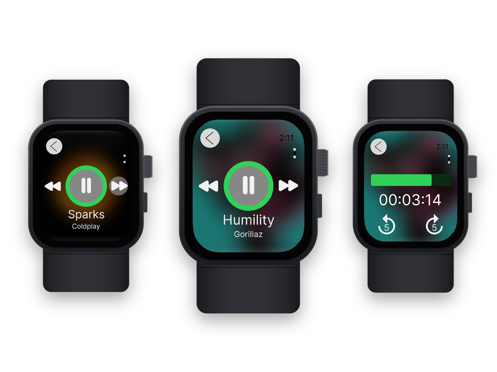
Apple Watch Now Playing
Four microinteractions for controlling music from the wrist
Year
2025
Duration
2 weeks
Role
UX/UI Designer
Team
Solo
Brief
For a two-week project in my microinteractions class, I redesigned the Now Playing screen on Apple Watch. I focused on the four things people do most while music is playing: knowing what's on, skipping tracks, finding a spot in a song, and changing the volume.
Role: UX/UI Designer (solo)
Tools: Figma
Year: Academic Project, Spring 2025
Length: 2 weeks
Problem
On a watch, you usually control music without looking for long, often mid-run or mid-commute. The current Now Playing screen gives very little back when you act on it. I mapped four gaps.
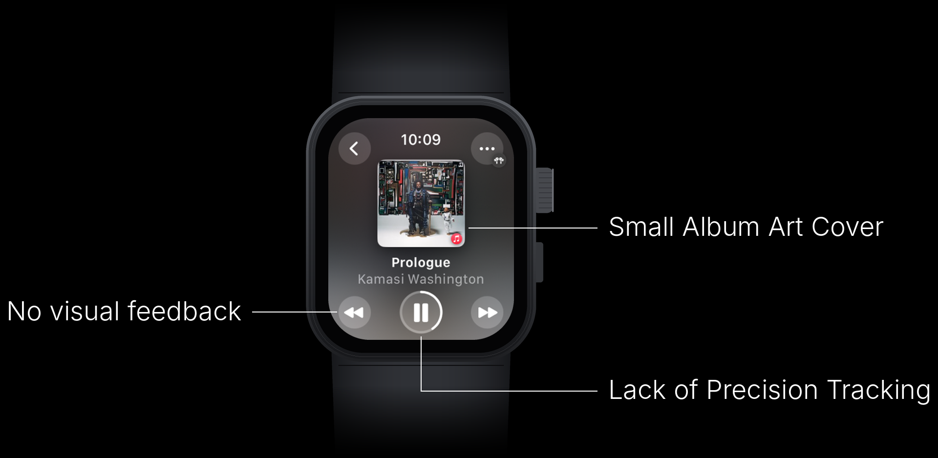
- Small album art. The cover sits in a small square, so the screen doesn't change much from song to song.
- No visual feedback on skip. Tapping next or previous doesn't confirm anything until the song changes.
- No precise seeking. The progress ring shows where you are, but you can't move through a song with it.
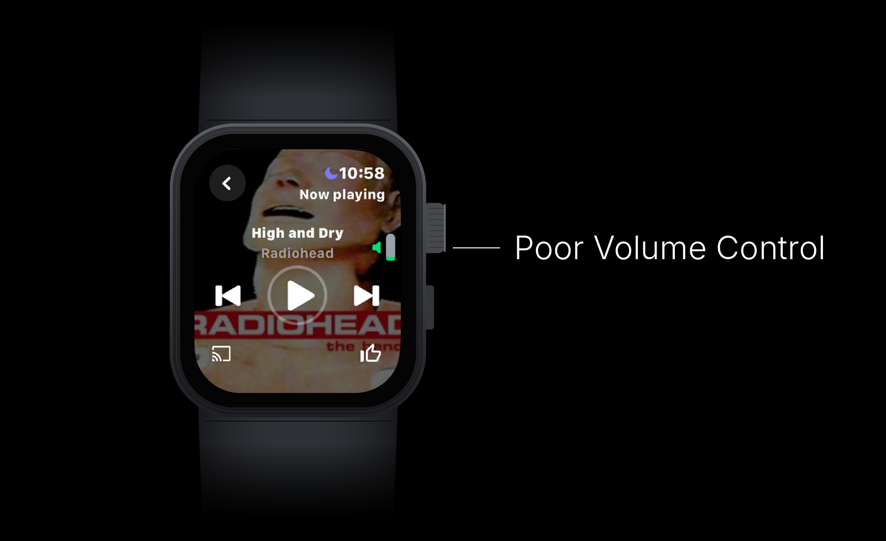
- Volume you can't read. Third-party apps show a tiny bar beside the title. It doesn't tell you how loud the audio actually is.
Approach
I treated each problem as its own microinteraction and defined it in four parts: the trigger that starts it, the rules that govern it, the feedback that tells you it worked, and any mode it puts the screen in. That kept each design small enough to prototype in two weeks and made it easy to check that nothing was silent.
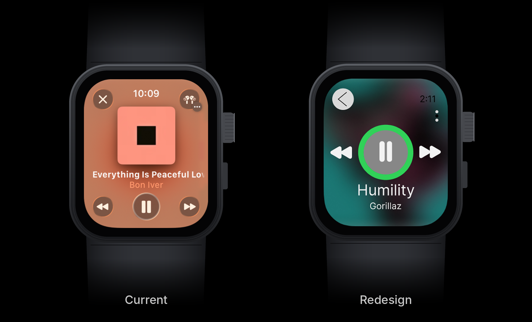
Album art as the background
Trigger: a song starts playing.
Feedback: the album art's colors are pulled out and blurred into the full background.
Mode: the background stays until the app is closed.
Instead of a small square, the whole screen takes on the song's color. You can tell a track changed at a glance, without reading the title. It also gave me room to make the play/pause button and track text larger.
Previous and next cues
Trigger: tapping previous or next.
Feedback: the arrow gets a highlight and nudges in the direction you're moving.
Rules: the animation stops when the next song starts.
The cue covers the gap between the tap and the new song loading. Paired with the album-art background, a skip now gives two signals: the button responds right away, then the whole screen changes color.
Prototype: each skip highlights the arrow, then the background shifts to the new song.
Precision tracking
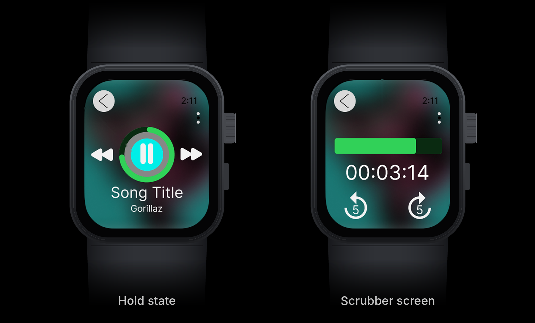
Trigger: press and hold the play/pause button.
Feedback: the button fills, then opens a new screen with a draggable time bar.
Rules: drag the green bar to scrub, or tap the arrows to jump back or forward 5 seconds. The time readout updates as you go.
A tap still pauses, so the main control doesn't change. Holding it opens the scrubber. I gave the hold a visible fill so you know something is happening before the screen changes.
When a song is paused, the ring turns red and the icon switches to play. Green means playing and red means paused, so you can tell the state at a glance. The icon change carries the same message for anyone who can't tell red from green.
Prototype: tap to pause, hold to open the scrubber, then tap the 5-second arrows.
Volume control
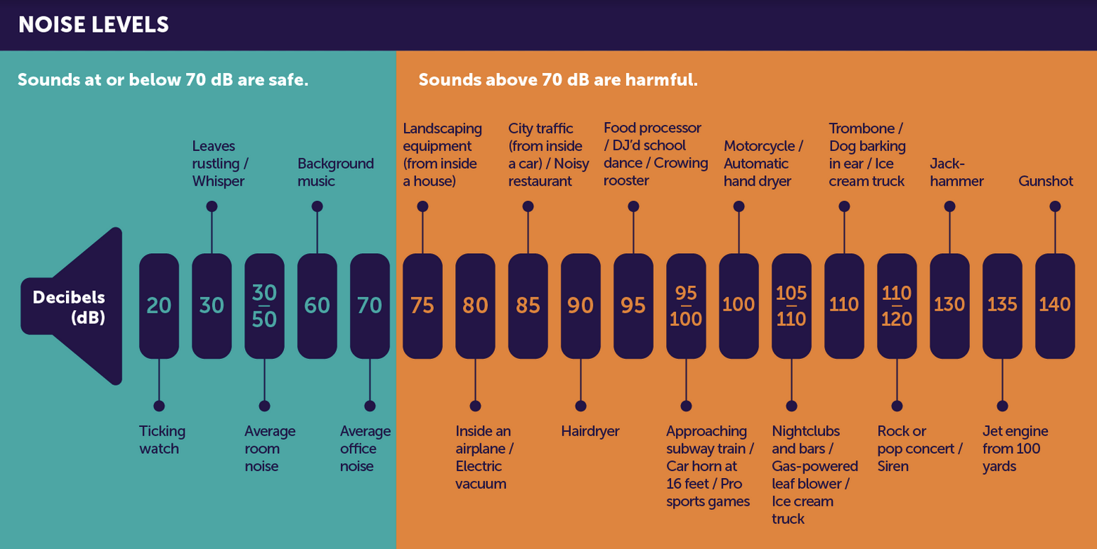
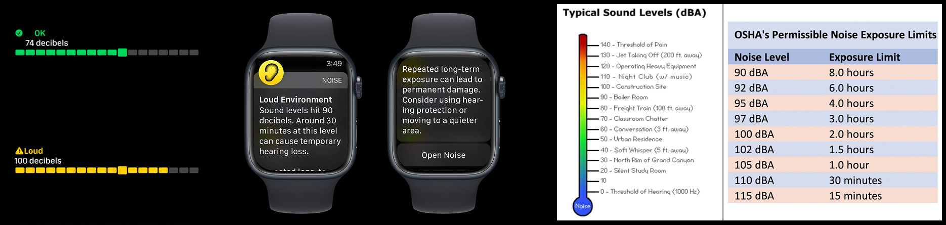
I wanted volume to mean something more than a fill level. Apple Watch already measures sound in decibels and warns you in loud environments, so I started there. Sounds at or below 70 dB are considered safe; above that, hearing damage can build over time (Hearing Health Foundation). Workplace limits allow 85 to 90 dB for only an eight-hour day, and the allowed time drops quickly as the level rises.
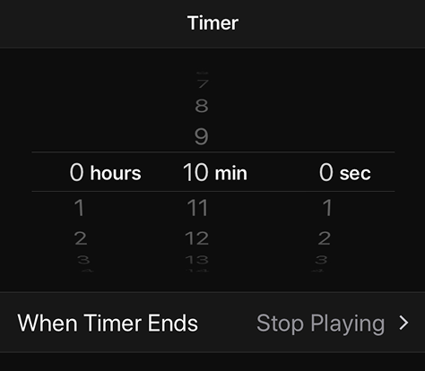
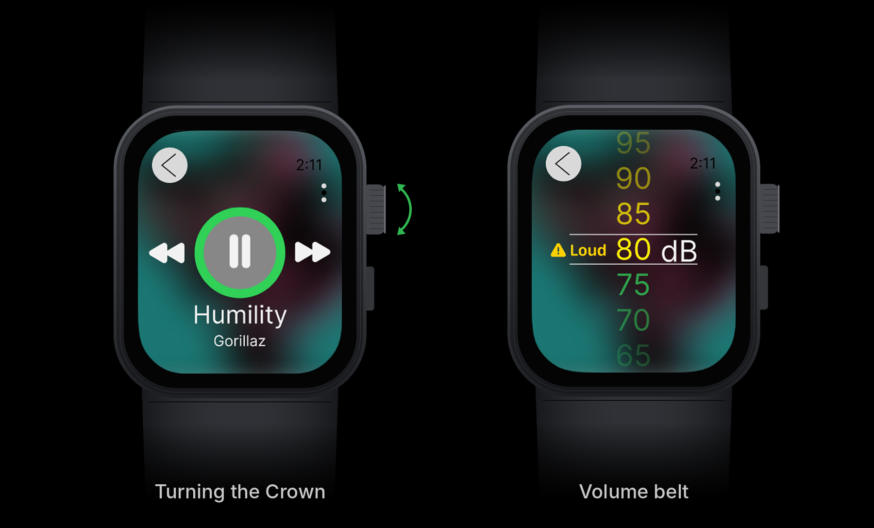
For the control itself, I borrowed the scrolling picker from the iOS Timer. The Digital Crown already turns like a wheel, so a vertical list of numbers matches what your fingers are doing.
Trigger: scrolling the Digital Crown on the main screen.
Feedback: a volume belt in decibels scrolls into view, shifting from green to yellow. At 80 dB a "Loud" label and warning icon appear.
Rules: the belt disappears after a few seconds without input.
I set the warning at 80 dB, about as loud as an electric vacuum: above the 70 dB safe level, and before the 85 dB range where workplace limits start. That way it shows up early, while you're still turning the volume up, not after you've been listening loud for a while.
I didn't rely on color alone for the warning. The word "Loud" and the icon carry the message for anyone who can't tell green from yellow.
Feedback
I walked friends through the prototype. Two things came up most: the larger buttons were easier to hit, and the changes cut down on accidental presses. On a screen this small, both matter as much as anything visual.
What I'd do next
- Test the hold with new users. My friends saw the prototype with me there. I'd test whether someone finds the scrubber without being told, since press-and-hold is hard to discover.
- Check contrast on every cover. White text over a light album (like a beige or pastel cover) could fail contrast. I'd add a dark scrim that adjusts to the extracted colors.
- Ground the decibel numbers. The belt shows output level, which depends on the headphones. I'd connect it to the headphone audio levels the watch already logs so the number matches real exposure.
- Revisit the threshold. By the chart I used, anything above 70 dB is harmful over time, yet 75 dB still shows green on my belt. I'd test a softer cue at 75 dB and keep the "Loud" warning at 80.
- Prototype the volume belt in motion. It exists as static frames. I'd build it with the Crown's haptic ticks so each step feels like a click.